 |
Invoice Management 6.2 |
|
Invoice Management 6.2 |

|
You use the Layout screen to control how items display on a form. To access the Layouts screen:
1. Click the Administration icon in the upper navigation pane. The Administration menu is displayed in the left navigation pane.
2. Click the Customization icon in the Administration menu. The Customization menu is displayed.
3. Click the Layouts icon in the Customization menu. The Layouts screen is displayed.
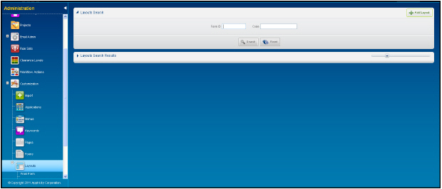
Note: Fields with bold text on the screen are required. All other fields are optional.
The following table defines the components on the Layouts screen.
|
Component |
Description |
|---|---|
|
Search Pane |
|
|
Add Layout button |
Displays the Add Layout pane. |
|
Form ID field |
A unique identifier assigned to the form. |
|
Code field |
Allows you to enter the code for the item (button, list, field, etc.) on the page. |
|
Search button |
Allows you to search for forms matching the criteria entered in the Search pane. |
|
Reset button |
Allows you to clear all data entered in the fields in the Search pane and search results list. |
Layouts Search Results Pane
This pane displays the results that match the criteria you entered in the Search pane fields.
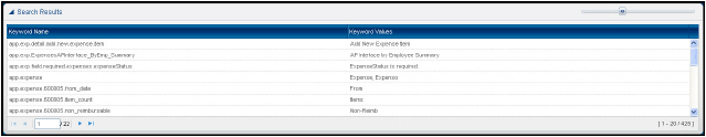
The following table defines the components on the Layout Search Results pane.
|
Component |
Description |
|---|---|
|
Search Results Pane |
|
|
Form ID column |
Displays the form identifier(s) matching the number you entered in the Search pane. |
|
Code column |
Displays the item code. |
|
Sort Order column |
Displays the sort order for the layout. |
|
Display Only column |
Indicates the field is a display only field. The user cannot enter data in this field. |
|
Required column |
Indicates the field is a required field. The form cannot be saved until data is entered in the field. |
|
Visible column |
Indicates the field is seen by the user. |
Add Layouts Pane
On this pane, you can add, edit, or delete layouts.
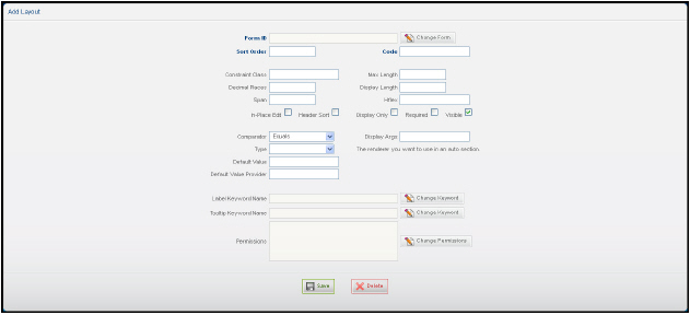
The following table defines the components on the Add Layout pane.
|
Component |
Description |
|---|---|
|
Edit Pane |
|
|
Form ID field |
A unique identifier assigned to the form. |
|
Change Form button |
Displays the Form Search window. |
|
Code field |
Allows you to enter an item code. |
|
Sort Order field |
The order in which the application is displayed on the page. The application icon furthest to the left has the lowest sort order number. The application furthest to the right has the highest sort order number |
|
Constraint Class field |
Allows you to add a validation constraint for the field. |
|
Max. Length |
The maximum number of alphanumeric characters that can be entered in the field. |
|
Decimal Places field |
The number of decimal places allows in the field. |
|
Display Length field |
Allows you to enter the number of alphanumeric characters that can be displayed in the field. |
|
Span field |
Allows you to define the length of the field. |
|
Hflex field |
Allows you to define the flexibility of the field for the horizontal value. |
|
In-Place Edit check box |
Future Release. |
|
Header Sort check box |
Allows the application to sort at the header level instead of the line level. |
|
Display Only check box |
When checked, the field is a display only field. The user cannot enter data in this field. |
|
Required check box |
When checked, the field must have data entered or the form cannot be saved. |
|
Visible check box |
When checked, the field is displayed for the users who have permission to view this field. |
|
Comparator list |
Allows you to set how a value is to be compared to another item. • Equals • Not Equal To • Greater Than or Equal To • Less Than • Less Than or Equal To • Like • In • Null • Not Null • Member of • Not member of |
|
Display Args field |
Allows you to enter any Java arguments needed for the function to work. |
|
Type list |
Allows you to select the renderer type. |
|
Default Value field |
Allows you to enter the default value for the field. |
|
Default Value Provider field |
Allows you to enter the provider for the default value. |
|
Label Keyword Name field |
The name assigned to the field. |
|
Change Keyword button |
Displays the Keyword Search window. |
|
Tooltip Keyword Name field |
Displays the tip message that appears when the mouse pointer hovers over the field. |
|
Change Keyword button |
Displays the Keyword Search screen. On this screen you can change the tip message that displays when the mouse pointer hovers over the field. |
|
Permissions field |
Displays the permissions assigned to this field. |
|
Change Permissions button |
Allows you to change the permissions assigned to this field. |
|
Save button |
Allows you to save the modified layout. |
|
Delete button |
Allows you to delete the selected layout. |